This is the third installment of a series on local climate.
To understand how people’s activities heat up a city, scientists use information on traffic, the energy used by homes, factories, and businesses, and where people live.
For example, Figure 4 shows the how the anthropogenic heat source is divided up during the day. This plot is for the 500 x 500 m area for which the anthropogenic heat source is largest in Beijing. This spot in Beijing has traffic-related peaks in the morning and evening, related to people riding or driving to and from work. So do Phoenix and Houston, and other cities with morning and evening rush hours. If you compare Figure 3 and 4, you will see that the anthropogenic heat source is bigger in winter. Can you guess why? Probably some of the difference is related to “domestic heating”, and some of the difference is because Figure 4 is for the place in Beijing with the largest anthropogenic heat source.
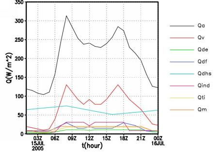
Figure 4. Estimated in anthropogenic heat source for the part of Beijing with the largest values. Qa = total, Qv = vehicle heating (based on traffic), Qde = from domestic electricity, Qdf = from domestic fuel consumption, Qdhs = from district heating system, Qind and Qti = from industry, Qm = from human metabolism. (Courtesy Shiguang Miao)
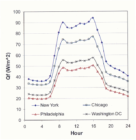
How do cities compare? Figure 5 shows the estimated daily pattern of the anthropogenic heat source from four U.S. cities during January based on citywide human energy-use patterns. It is important to note that this figure represents the city-wide average heating rather than the local peak in the downtown areas (as illustrated in Figures 3 and 4 for Beijing). In New York City, the city-wide average reaches almost 100 Watts per square meter. Can you guess why the four cities differ? (Remember that the previous figures are only from a part of Beijing, so we can’t compare Beijing to New York with the information we have here.)