
The amount of CO2 given off by industry in a year
Figure 1 is a diagram of the carbon cycle from the GLOBE Carbon Cycle Project, based at the University of New Hampshire. This diagram shows where the carbon is, and where it is going. So, for example, industry produces about 6 petagrams of carbon a year. What is a petagram? A petagram is written 1,000,000,000,000,000 grams, which can be written 1 times 10^15.
In order to compare the value of CO2 production for human respiration to the “flux” or exchange terms in the diagram (in red), we have to (a) convert it to a flux for carbon rather than CO2 and (b) compute a total for the entire world population for a year.
So, we take
0.9 kg per person per day, times
6,700,000,000 people in the world, times
365 days in a year (neglecting leap years), to get
220,000,000,000 or 2.2 x 10^11 kg or 2.2 x 10^14 grams, or
0.22 petagrams
To convert this to carbon, we multiply by 12/44, the fraction of CO2 that is carbon, to obtain 0.06 petagrams a year.
From Figure 1, that’s about 1% of most of the exchange terms, and about one-hundredth the carbon released by burning fossil fuels globally. And less than one-thousandth the amount of carbon uptake by plants.
What does this really mean? It was pointed out to me by Richard Wolfson, a professor of physics at Middlebury College [who wrote the book Energy, Environment, and Climate (W.W. Norton, 2008), cited a few blogs ago.], that we get our energy from plants, or animals that eat plants, or animals that eat animals that eat plants, so one could argue that we are “carbon-neutral” in the sense that we are part of the natural system, with the plants taking back the carbon we emit. Only in a sense, however – as Wolfson notes, our food production is not carbon-neutral: we produce carbon dioxide in growing the food and transporting the food, not to mention keeping it warm or cold, and, usually, cooking it.
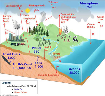
Figure 1. The carbon cycle. The numbers in blue in represent the amount of carbon stored (e.g., 38,000 petagrams of Carbon in the ocean). The numbers in red represent “fluxes” – carbon flowing from one part of the earth system to another. Figure © GLOBE Carbon Cycle.
CO2 from Space
Figure 2 is a snapshot of the global distribution of CO2 at 8 kilometers (5 miles) above the surface. This is high enough so that there is a lot of mixing by the winds, but you can see a pattern anyway. And the pattern is associated with the sources and sinks of carbon in Figure 1.
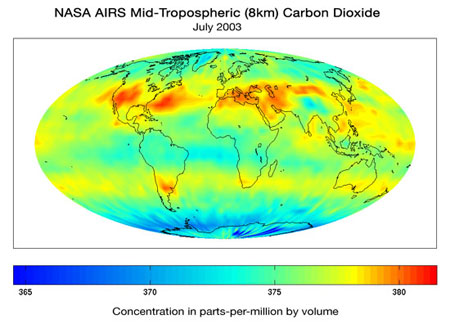
Figure 2. July 2003 average CO2 from the Atmospheric Infrared Sounder (AIRS) on the Aqua Satellite. From http://www-airs.jpl.nasa.gov/Products/CarbonDioxide/. Preliminary data.
For example, the higher values are associated with the industrial parts of the world. The high values in the north Atlantic are downstream from the United States and Canada. The lowest values are over the high-latitude oceans in the Southern Hemisphere and over Antarctica.
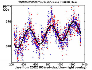
Figure 3. CO2 from AIRS. From http://www-airs.jpl.nasa.gov/Products/CarbonDioxide. Preliminary data. The curve shows carbon dioxide decreasing in the Northern Hemisphere spring and summer, when vegetation is growing and leafing out, and increasing in fall and winter, when respiration dominates.
The “snapshot” in Figure 2 is from the Atmosphere Infrared Sounder (AIRS) on the NASA/Aqua satellite. These data can also be used to look at trends in the global average CO2. Like the well-known surface-based curve from Mauna Loa, there is an upward trend, and you can clearly see the effect of the seasons. If you compare this figure to the curves in the blog Land Use and CO2, posted 7 September 2007, you will find the curves quite similar, with CO2 decreasing during the Northern Hemisphere spring and summer. As noted there, this decrease in carbon dioxide is associated with photosynthesis. During photosynthesis the plants take carbon dioxide out of the atmosphere and use it to grow and leaf out. It is not surprising that photosynthesis is the largest term in Figure 1.