Interpret GEO Image - Clouds Protocol


How to Interpret Satellite Data: Geostationary Earth Orbiting (GEO)
Geostationary Earth Orbiting (GEO) satellites follow an orbit around the Earth above the equator at about the same direction and speed of the Earth’s rotation. This allows the satellite to remain focused on one area of the Earth's surface at all times. Learn more by watching this Geostationary satellite video.
This geostationary positioning is most common with communication and weather satellites. The (almost) fixed position enhances the ability to monitor sensitive changes in our environment, like weather! Multiple weather GEO satellites work together to monitor the entire globe. The area they observe, called a footprint, covers a majority of the oceans and continents, not capturing the poles.
The team at NASA Langley Research Center uses the following satellite data to match with GLOBE's cloud observations:
|
GEO Satellite |
Country, Agency |
|---|---|
|
GOES-13, GOES-15, GOES-16, GOES-17 |
USA, NOAA |
|
HIMAWARI-8, HIMAWARI-9 |
Japan, JMA |
|
METEOSAT-8, METEOSTAT-9, METEOSAT-10, METEOSAT-11 |
Europe, EOEMS |
Finding the GEO Image
Members can find the GEO image on their satellite match table, the link(s) sent by personalized email from NASA. The satellite data is in the center of the table. The ground data is on the right side of the table. Look to see if these observations matched to GEO. Follow the column down to see which GEO satellite matched the observations (see the table above for more details). There are also small images with the words "Visible" and "Infrared" above them. Those are the two different ways to look at the GEO image.
Understanding the GEO Image
The team at NASA Langley Research Center will send members a visible image and an infrared image obtained from GEO. What does this mean? These words — visible and infrared — determine information gathered in those parts of the electromagnetic spectrum.

In other words, it means that members get to see the world using two different types of lenses — the visible, which is as if it were seen from the actual satellite (part of the electromagnetic spectrum that people can detect with their eyes), and the infrared, which is the part of the electromagnetic spectrum just below the color red. Infrared wavelengths are larger than the red color. The larger the wavelength (or space between each wave crest), the less energy, thus it is referred to as "infra" or below the red. Infrared wavelengths are used to look at heat or temperature signatures.
Below is additional information about the electromagnetic spectrum.
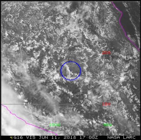
a) Visible: This image shows what the satellite observed in the visible portion of the electromagnetic spectrum, the range of light people can detect with their eyes. The image received is what the satellite detected and has not been corrected or processed. This is what the satellite collected. Why is it that there are no colors in this image when there are colors visible to the naked eye? Satellites collect information using remote sensing, which then is converted into images by computers. Colors can then be assigned for each "band" of data received. This presentation walks through how information from satellites is converted into an image.
a. Orientation and Contours
 The image is centered on the member's location with a blue circle and dot marking their exact location on the image based on the latitude and longitude information they reported. North is the top part of the image.
Gray lines show the latitude and longitude lines, with values in red and green. State and country lines are shown by pink contours.
The bottom of the image shows the GEO satellite matched to (see table above for more information), the type of image (visible or infrared) and the date and time in UTC. In the example shown, the match is to GOES 16 (G16), looking at the visible image (VIS), taken on 11 June 2018 at 5:00 p.m. Z.
b. Colors
The image has different shades of two main colors — white and gray. Shades of white are mainly clouds, while the shades of gray are things that are not clouds; for example, bodies of water, forests, deserts and shadows from the clouds.
Note: If observations were taken at night, this image will be black. There will still be the latitude and longitude lines and the circle marking location.
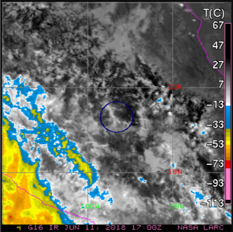
b). Infrared: This image shows what the satellite observed in the infrared portion of the electromagnetic spectrum. Infrared is used to detect temperature signatures, so this is the temperature in degrees Celsius. The image received is what the satellite detected and has not been corrected or processed. This is what the satellite collected.
a. Orientation and Contours
The image is centered on the member's location with a blue circle and dot marking their exact location on the image, based on the reported latitude and longitude information. North is the top part of the image.
Gray lines show the latitude and longitude lines with values in red and green. State and country lines are shown by pink contours.
The bottom of the image shows the GEO satellite matched to (see table above for more information), the type of image (visible or infrared) and the date and time in UTC. In the example shown, the match is to GOES 16 (G16), looking at the infrared image, taken on 11 June 2018 at 5:00 p.m. Z.
A temperature scale is found on the right-hand side of the image in degrees Celsius.
b. Colors
The colors on this image relate to temperature. Note the temperature scale on the right side of the image. Warmer temperatures are at the top of the scale in darker colors, while cooler temperatures are at the bottom of the scale in brighter colors. The temperature is measured in degrees Celsius as seen on the top of the scale.
What do the different colors mean? The colors on the image provide information about the temperature of the different things found in the image.
How can a member tell what they are looking at? The first step is to identify the surface. This is done by looking for the warmest temperature found on the image and pinpointing that location. Note that this is not the warmest temperature on the scale; the scale goes to higher and lower values found on the image. Clouds will be cooler than the surface. They might be really close to the temperature on the surface, but clouds will not be warmer than the surface. Use the visible image to also help distinguish between clouds and surface.
c). How to use visible and infrared images together
1. Look for the surface: Looking at the example visible image (image on the left), there are clouds with spaces between them near the middle of the image. The spaces between the clouds in the middle of the image are the darkest shades in the infrared image (image on the right).
2. Identify temperatures measures on the infrared image: These black spots are the warmest, at about a temperature of 30 degrees Celsius, even though the scale goes to 67 degrees.
How to tell the difference? Look at the color around the darkest shades. Then, look for this color on the scale to find the darker shade. Now, look at the different colors on the image — there are clouds that are colder on the bottom left corner of this example, compared with the clouds in the rest of the image.
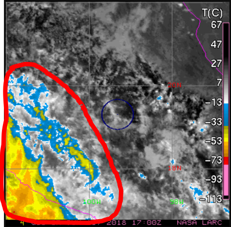
3. Estimate cloud types/heights : Remember that the temperature in the troposphere, where most clouds are found, decreases or gets colder with height. So the colder clouds (warmer colors) are at a higher altitude than the less bright ones. In this infrared image we have clouds at higher altitude in the bottom-left corner, compared to the rest of the clouds. However, satellites look at the top of clouds, so the correct statement would be that the tops of the clouds at the bottom-left corner of this image are at a higher altitude than the rest of the clouds in this image. These can be high clouds or a cloud that has vertical growth, where the bottom is close to the ground but has grown to have the top of it be at a higher altitude, like a cumulonimbus cloud.
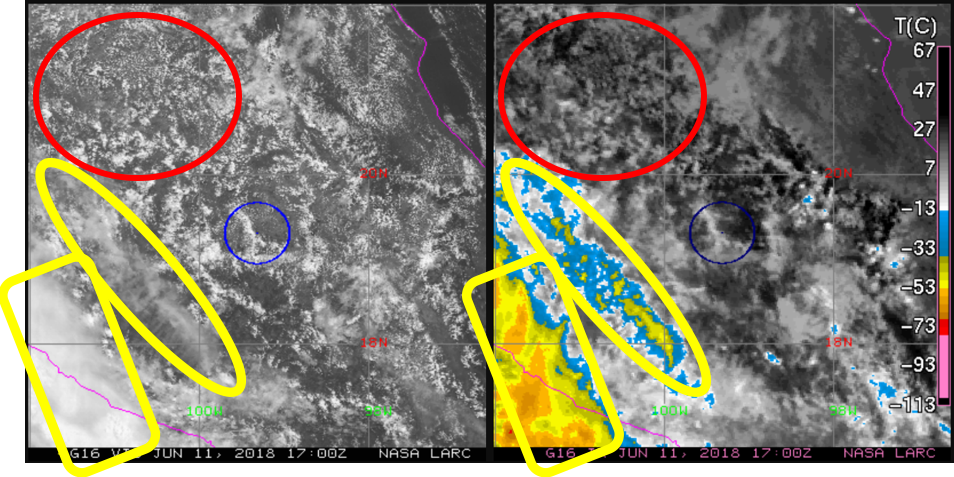
How to tell the difference? The shape of clouds provide a clue as to the type of cloud on the visible image. In this example, the clouds look thin and wispy (see the yellow areas). These are descriptions for cirrus clouds, which are high clouds. The other clouds look puffy (see the red area), a description used for a cumulus type cloud. Because of the temperature observed in the infrared image, a good guess would be that these cumulus type clouds are at either low- or mid-level in altitude. Great job!
What can members do with their GEO images?
GLOBE invites members to study their images and compare them with cloud observations. Here are some ways:
- Cloud Types
Look at the visible and infrared images and try to identify the cloud types observed. Members can estimate what cloud types did the satellite capture in the image by the shape and temperature. Read through the portion titled “How to use visible and infrared images together” above for guidance.Tip: Remember how clouds are named? The three basic names — cumulus, stratus and cirrus — are based on how these cloud types look (puffy, long and thick, and wispy, respectively).
Take it a step further: Look at the satellite match table to see what altitude (low, mid, high) the satellite identified for these clouds. Then, members can have a good guess at the cloud type in the image.
- Estimate Total Cloud Cover
How does the estimate compare to observations? How does it compare to the satellite’s report? Discuss why they might be different.
Tip: Remember that the view from the ground up is not as extensive as the satellite’s view from space looking down at Earth.
Take it a step further: Estimate the amount of coverage per cloud type identified in the image.
- Calculate Size of Image
The GEO images include latitude and longitude lines. Members can calculate the degree difference between each line and convert the degrees to kilometer or another measure of distance. Now they can calculate the size of the image.
Tip: Remember that the red numbers are latitude while the green numbers are longitude.
Take it a step further: Members can estimate the area of land in the image. They can also calculate area for each individual box created by the latitude and longitude lines.
- Calculate Total Cloud Cover
The team at NASA Langley Research Center matches GLOBE observations to satellite data by looking up from the spot in every cardinal direction. Members can also use their size of image calculations above. Calculate total cloud cover in that box. How does this result compare to the reported total cloud cover observations on the satellite match table?
Tip: Use grids printed on transparency sheets to get a more precise calculation of total cloud cover. Members can use the sheets on top of the printed image, or by taping the sheets onto the computer monitor.
Take it a step further: Calculate the percent difference between the estimated total cloud cover and the calculated total cloud cover. Discuss the results.